Charis Tsevis, 2025
A vibrant, multilayered mosaic illustration of a person standing with arms outstretched, created using an advanced ASCII art technique. The figure is composed of intricate geometric shapes, symbols, and directional arrows in gold, blue, and green tones, forming a richly textured silhouette against a soft sky background. The words "ROBERT MILES" and "DREAMLAND" are subtly embedded into the design using typographic elements.
Note: This piece focuses on character-based art (typewriter, ASCII, ANSI, etc.) and the human impulse to create within fixed systems, rather than general typography or letterform design.​​​​​​​
A Hacker's Son and the Poetry of Wires
My father, Dimitris, isn't an artist—at least not in the conventional sense. He is a post-war telecommunications engineer from Greece, inventive, and endlessly curious. His world isn't filled with punch cards or terminals, but with coils, oxidized hand-drawn circuits, relays, resistors, signal lamps, and, most of all, telephones, stripped down, reconnected, rewired.
He built his own calculators before they were widely available. Later came the Texas Instruments scientific calculator, a marvel of its time. Then processors were wired to minimalist displays showing 8 to 12 characters on dot-matrix grids. He wrote code directly in machine language, using hexadecimal logic. There were no interfaces—just raw structure and imagination.
As a traditional Greek father, he never demanded I follow him, but I felt the quiet tug. I wanted to be an artist. I was always drawing and dreaming of a career in fine art or music. Yet he never dismissed this. He admired my talent, and gently guided me toward a broader view: technology, too, could be poetic.
He'd bring home fragments—circuits salvaged from antique shops—and hold them up like relics: "Aren't these beautiful?" And he was right. These weren't just functional—they were lyrical. I didn't become an engineer, but I didn't turn away from his world either. I found a bridge: design. A place where form and function, grids and grace, could meet.
A vintage photograph of a young man standing outdoors, with a backdrop of blossoming trees. The warm, sepia-toned lighting gives the image a nostalgic feel, capturing a moment from the 1970s.

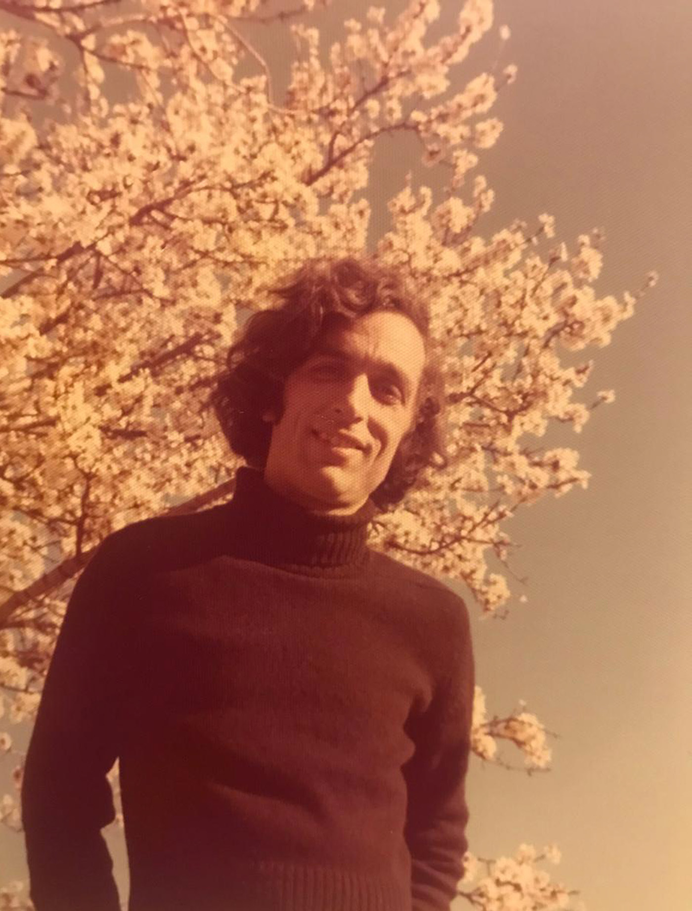
Dimitris Tsevis in the 1970s
This portrait captures a youthful Dimitris Tsevis, my father whose inventive spirit and curiosity shaped my world. This photograph reflects the quiet creativity and ingenuity that would later inspire me to find a bridge between art, science and technology.

From Newsrooms to Monochrome Machines
In 1985 or 1986, I came into professional contact with computers while working at a newspaper in my hometown, Athens. These weren't sleek Apple machines. We had scanners as large as couches, Crossfield ColorSpace or Studio 9500, Linotype phototypesetting systems, and green-screen terminals where you typed line by line in monochrome.
The early Macintoshes were there, too, small, curious boxes. Not yet powerful enough for serious production. But I was drawn to them. Even in their limitations, there was possibility, and obvious excitement.
Back then, you had to think structurally. You couldn't fake anything. Layouts had to be encoded with discipline. It was like composing a piece of music where every note had meaning. It prepared me to understand the elegance of constraint.

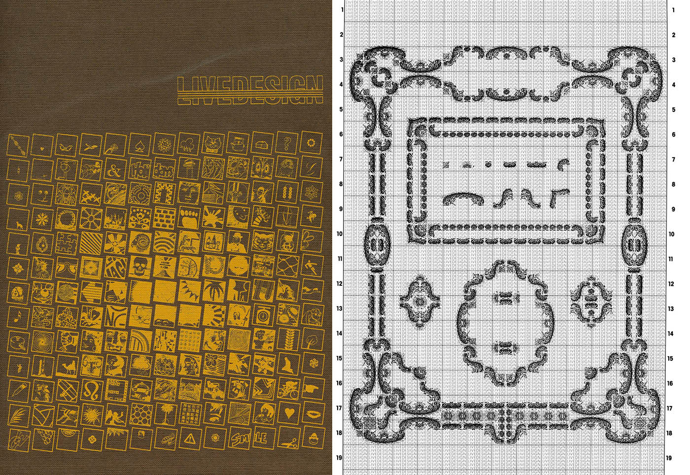
Cover Art from "Livedesign" Catalogue by Livesatz
This striking cover design combines meticulous iconography with ornate typography, reflecting the rich graphic traditions celebrated in the 800-page "Livedesign" catalogue. Published by Livesatz, the artwork exemplifies the blend of precision and creativity that defines the collection. More gems like this can be found at the Museum für Gestaltung Zürich in Zürich.

Early Character Art: From Typewriters to Teletypes
The origins of machine-based visual art predate computers by decades. In the late 19th and early 20th centuries, creative typists were already producing remarkable images using mechanical typewriters. Artists meticulously positioned the carriage, selecting each character for its visual weight and form rather than its linguistic meaning.
Flora F.F. Stacey's 1898 butterfly portrait stands as a testament to this technique, created by carefully feeding paper through a typewriter multiple times at different angles to build up the image. These early practitioners faced significant constraints, the lack of certain characters (such as forward or backslash), limited control over spacing, and the challenge of precisely aligning overlapping elements. Yet, these limitations sparked ingenious solutions.

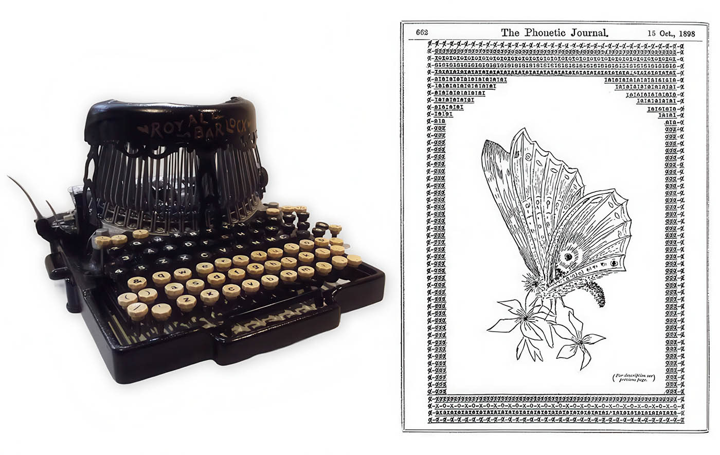
Flora F.F. Stacey's 1898 butterfly, made using her Royal Bar-Lock typewriter, is considered the first human-machine collaborative artwork. It was largely forgotten for nearly 70 years until Australian poet Alan Riddell highlighted it in his 1974 book Typewriter Art (PDF of the book here), following an exhibition at London’s Barbican Centre celebrating the typewriter’s centenary.

Artists like James Cook keep this tradition alive by making impressive architectural and landscape pieces with typewriters. His careful technique and modern approach to an old method demonstrate that character-based art remains appealing, even with numerous digital options available.
A particularly important technique was overprinting , also known as surprint, which involved typing a character, backing up, and then typing another character on top of it. This created a density of marks that could simulate shading and texture. In the 1970s, educational systems like PLATO elevated this approach, using overprinting with superscript and subscript characters to create sophisticated graphics, including remarkably expressive smiley faces.
Moving from paper to screens opened up new options. On paper, overprinting made characters overlap, but on early video screens, the pixel effect let these marks blend into smooth graphics. Artists could control how dark an area looked by choosing and layering different characters, a method that digital ASCII art later improved into detailed tonal scales.
These mechanical antecedents laid the groundwork. These early mechanical methods set the stage for computer-based character art. They introduced key ideas, such as using letters and symbols as building blocks, working with strict grids, and finding creative ways to utilize standard elements.
A black-and-white image composed entirely of electronic circuit symbols forming the shape of a nude dancer. Created in 1966 at Bell Labs using an IBM 7094 computer, this pioneering digital artwork merges art and technology in a striking visual experiment.

Studies in Perception I (1966) by Kenneth Knowlton and Leon Harmon, created at Bell Labs using an IBM 7094 computer. This early digital artwork reimagines a photograph of a nude dancer through electronic circuit symbols, blending art and engineering in a groundbreaking fusion of technology and human expression. You can enjoy a signed copy of this early masterpiece in V&A museum in London. 

Bell Labs: When Engineers Dreamed in Code

If there were a modern monastery for machine art, it would be Bell Labs in the 1960s. Officially, the research arm of AT&T, it was in truth a sanctuary for thinkers who didn't separate poetry from programming.
Here, Kenneth Knowlton and Leon Harmon utilized an IBM 7094, one of the most powerful computers of the time, to create "Studies in Perception I" (1966), a photographic image recreated using electronic circuit symbols. The image of a nude dancer appeared in The New York Times, scandalizing some, mesmerizing others.
What mattered more than the subject was the medium: characters as pixels. Symbols are becoming a visual tone. It was not just about data. It was about perception, about making a machine see.
This wasn't a sideshow to science. It was science. Knowlton once described ASCII art as "pointillism with punctuation." At Bell Labs, art and computation were part of the same pursuit: how to speak through structure.

A clip from The Incredible Machine (1968), remastered and shared for educational use. This excerpt highlights the pioneering work of Kenneth C. Knowlton and Stan Vanderbeek at Bell Labs, where they developed BEFLIX ("Bell Flicks"), one of the first programming languages for creating bitmap computer-generated animations—laying the foundation for digital art and motion graphics.

Few figures in the history of computer art have inspired me as deeply as Ken Knowlton. A computer scientist at Bell Labs, he wasn't just a pioneer of ASCII and mosaic techniques—he was a philosopher of the machine age.
In his 2012 Brief Manifesto, Knowlton wrote:
"What the world needs is a massive consortium from science, math, social sciences, history, philosophy, religion, economics, business, politics—to devise downsizing schemes... leading to safeguards, stockpiles, backups, plans-B, austerity triages, etc." 
—Ken Knowlton
This was not just a call to innovate, but a call to care. His work reminds us that digital art is never only about beauty; it is a matter of ethics. It mirrors our vision of the world and shapes the future we dare to imagine.
From his groundbreaking invention of BEFLIX to his imaginative collaborations with Stan Vanderbeek, Knowlton’s legacy reminds me daily that code can carry a conscience and pixels can challenge power. I am eager to share more stories about him soon.
Hackers and the BBS Renaissance
While Bell Labs explored from the top down, hacker culture grew from the grassroots. In the 1970s and 80s, hackers, many of them teenagers, built worlds out of text. On dial-up Bulletin Board Systems (BBSes), they created everything from menus to animations using ASCII and ANSI.
This was a culture of do-it-yourselfers, full of passion and strong beliefs. These people were not just builders; they thought deeply about technology. For them, sharing, exploring, and finding beauty all happened in lines of code. Machines were not cold or lifeless. They were full of potential.
Groups like ACiD and iCE made monthly artpacks, which were collections of ASCII and ANSI pictures, slogans, poems, and digital graffiti. The tools were simple: a keyboard and a text editor. However, the results were amazing - portraits, logos, and animations, all created using symbols.
It was, in a way, a form of digital street art. Decentralized. Ephemeral. Aesthetic. And deeply human.
As Tim O'Reilly once quoted: "In areas of uncertainty and change, we don’t know what the right answer is. And there are many people who want to stay as it is, and another set of people who say we want to (as Wallace Stevens once said this memorable phrase) search for its possibility. That’s why “hackers”, people who are on the edges, we really owe them a debt. They are out there figuring out the future."
These hackers were already living that truth.
A black-and-white photograph showing a man standing in a workspace, holding a tall sheet of paper covered in dense printed text. Another person is partially visible in the background, focused on work near a piece of electronic equipment. The scene suggests a historical context of early computing or data processing.

Portrait of Sophie at the Computing Center of the City of Helsinki, December 11, 1964. Photo by Olavi Kaskisuo / Lehtikuva.

ASCII Art: A Love Letter to the Grid
ASCII—short for the American Standard Code for Information Interchange—was never intended to be beautiful. Introduced in 1963 to standardize machine communication, it offered 128 characters, 95 of them printable. Just enough for the English language, a few symbols, and control codes.
Sometimes, beauty appears not because it was planned, but because of limitations.
What makes ASCII art special is not the set of characters, but the fact that it seems like it shouldn't work for making pictures, and yet it does. Artists have long enjoyed this puzzle: how to turn letters, punctuation, and symbols, which are usually used for writing, into feelings, mood, and movement.
As a young designer using computers for the first time, I was amazed by how people could make the grid do what they wanted. How a face could show up from slashes and dots. How a landscape could appear from letters on a screen with no special graphics, no color—just evenly spaced letters and a lot of imagination.
ASCII art didn't start in art galleries or studios. It began in labs, basements, dorm rooms, and computer rooms. People made it because they had to, and it became creative. The first pieces were created using old printers and machines that transformed letters into movements. The results were straightforward, often beautiful, and sometimes rough. To shade a cheek, you didn't use colors—you picked a period, a colon, or a semicolon. Every choice could be seen. Every symbol mattered.
As the form evolved, communities began to form around it. On bulletin boards and Usenet groups, artists traded portraits, comics, signatures, and even visual jokes. Some of it was anonymous. Some signed with pseudonyms, such as "jgs" or "Spunk." But all of it lived in a shared world: one made of monospaced grids and imagination.

An in-depth exploration of the origins and evolution of the underground ANSI/ASCII art scene, highlighting its early rivalries, the personal sacrifices made by group leaders, and the challenges of creating monthly art packs.

The Many Dialects of ASCII Art
ASCII art isn't a single form. It's a family of visual languages, each with its own goals, methods, and emotional tone.
Tone-Based ASCII Art
This is perhaps the most iconic style, the one that simulates grayscale and shading by assigning visual weight to characters. A space is the brightest tone. A period is a whisper. A percent sign is deep shadow.
Artists in university labs and hacker basements alike would render portraits, logos, or moody scenes using strings like ".:-=+*#%@". Characters weren't chosen for their semantic meaning, but for their visual mass and texture.
This was pixel art without pixels. An act of translation: from light to logic, from shade to symbol.
Structure-Based ASCII Art
While tone-based art leans into illusion, structure-based ASCII is all about form and outline. These works depict recognizable objects, faces, animals, and landscapes, using characters that echo their shapes.
Think of a smiling face made from :) or the classic shrugging figure ¯\*(ツ)*/¯. These aren't just jokes. They're reduced symbols of emotion. Minimalism through typography.
I remember the first time I saw an animal drawn with nothing but slashes, underscores, and carets. It wasn't complex, but it felt alive. That's the magic of structure-based ASCII: when a few well-chosen characters say more than a thousand pixels.
Decorative and Symbolic ASCII Art
There's another type that's harder to describe: ASCII art that does not depict objects or attempt to resemble real lighting. Instead, it uses patterns, simple shapes, and symbols.
You'll find this kind of art in hacker zines, email signatures, or sprawling keyboard carpets that resemble Islamic geometric tilings or mandalas. Sometimes, it's poetic. Sometimes, chaotic. But always intentional.
It's a kind of calligraphy for the digital age: precise, expressive, symbolic.
A collection of examples illustrating different types of ASCII Art, including typewriter-style lettering, simple line art, solid art, shading techniques, and pixel-based images created with block elements. The examples highlight the versatility of ASCII characters in forming intricate designs and patterns.

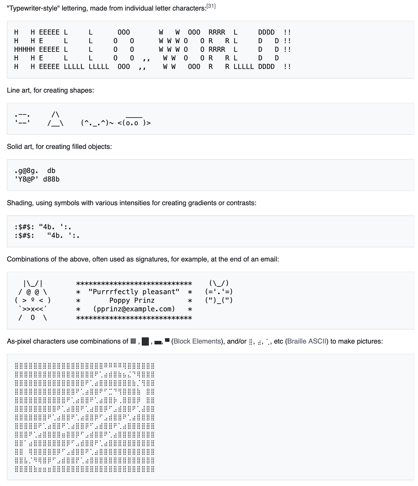
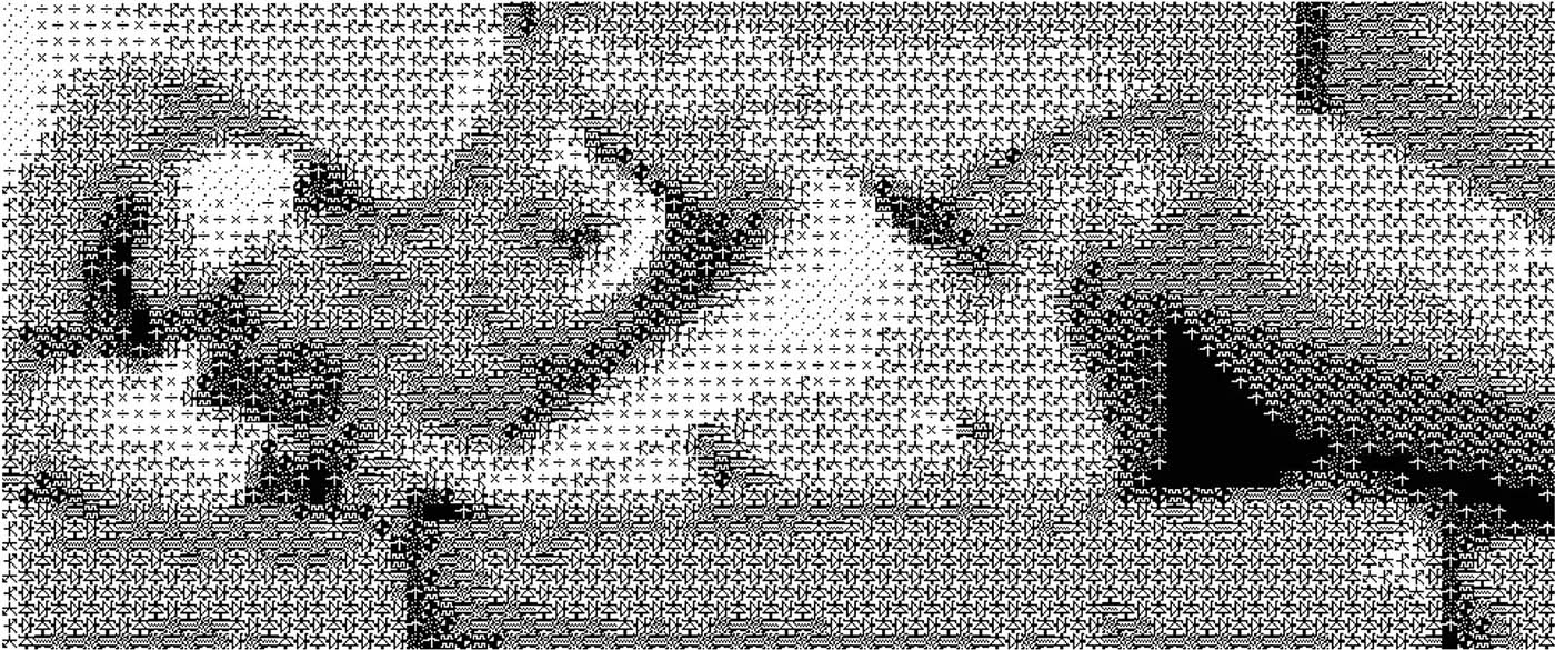
Examples of ASCII Art showcasing various styles: typewriter-style lettering, line art for shapes, solid art for filled objects, shading techniques, and pixel-based images using block elements. This demonstrates the creative use of text characters to form visual designs.

Beyond the Monospace Grid: Variations in Character-Based Art
The evolution of ASCII art isn't just a story of different character sets—it's also a tale of artists breaking free from fundamental constraints and pushing the boundaries of what text-based imagery could be.
Non Fixed-Width ASCII: Breaking the Grid
Traditional ASCII art was inherently bound to the monospaced grid, where every character, whether an "i" or a "w", occupies the same horizontal space. This limitation was foundational, stemming from early computers and teletypes with their fixed-width fonts, such as Courier. But some artists deliberately rejected this constraint.
Non-fixed-width ASCII emerged as artists began creating works designed specifically for proportional fonts, where each character occupies only the space it needs. This shift wasn't just technical; it was philosophical. Instead of seeing characters as uniform blocks in a perfect grid, these artists approached them as unique shapes with intrinsic visual properties. They leveraged the varying widths of letters in fonts like Helvetica or Times Roman, using characters not for their tonal values but specifically for slopes, borders, and block shading.
The results could achieve remarkable precision with fewer characters, but at a cost: these works became font-specific, designed to display correctly only in particular proportional typefaces. The predictability of the fixed grid was sacrificed for greater expressive freedom. It was a trade-off between accessibility and potential—a recurring theme in the evolution of digital art forms.
 Qwen3-235B-A22B Caption:  "ASCII Horse in Motion: A creative ASCII art animation inspired by Eadweard Muybridge’s iconic running horse photos. The animation is crafted entirely using text characters, bringing the classic imagery to life through digital creativity."  Alt Text:  An animated GIF showcasing a horse running with a rider on its back, created entirely using ASCII art. The animation is based on Muybridge’s historic photographs of a horse in motion and features hand-placed text characters to form each frame. The artist used Monodraw for Mac to create the piece, focusing on scaling the artwork around the rider’s head as a key reference point. Each frame was meticulously crafted by copying and modifying the initial text layout.

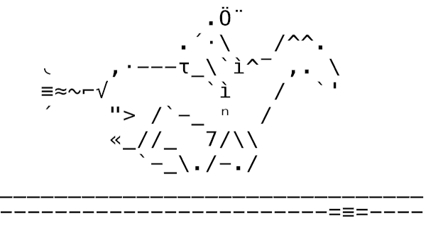
ASCII Horse in Motion: A creative ASCII art animation created by Doctor M. Popular, inspired by Eadweard Muybridge’s iconic running horse photos. The animation is crafted entirely using text characters, bringing the classic imagery to life through digital creativity.

Animated ASCII Art: Time as a Dimension
Static images were just the beginning. As early as the 1970s, artists using VT100 terminals discovered that text could move. Animated ASCII art, also known as "ASCIImation," brought text art to life by moving the cursor around, deleting characters, and erasing parts to create the illusion of movement.
These early animations were painstakingly crafted, often by a single artist telling a visual story one character at a time. The process was labor-intensive, but the results were magical—text that seemed to defy its static nature.
The web era breathed new life into this form. With JavaScript and Java applets, artists could display sequences of ASCII frames in rapid succession, mimicking the principles of a film projector. This opened doors to increasingly sophisticated techniques: morphing characters, simulating star fields, creating fade effects, and even generating calculated fractals in real-time.
Today, tools and programs like AAlib (for black and white) and libcaca (for color) can automatically convert regular pictures or live video into text art. Handmade art has been replaced by computer-generated art, marking another step in how people and machines collaborate creatively.
An image of the keyboard layout for the PET 2001 computer, featuring a section dedicated to PETSCII graphics characters. These characters include a variety of symbols and glyphs designed for creating visual effects and artistic designs within the limitations of text-based systems. The layout illustrates the innovative use of character sets in early computing.

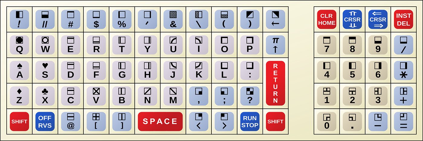
PET 2001 keyboard Layout: A showcase of PETSCII graphics characters, highlighting the unique set of symbols and glyphs used in early Commodore PET computers for text-based graphics and creative displays.

Semigraphics: Beyond the Standard Character Set
While ASCII artists worked with only 95 basic characters, semigraphics artists used extra symbols made just for creating pictures. These special "line drawing characters" or "pseudo-graphics" helped them build more detailed images using text.
Character sets like IBM Code Page 437 (used in ANSI art) and PETSCII (on Commodore 64 systems) included dedicated box-drawing characters, block elements, and shading symbols that transcended the limitations of standard ASCII. An ANSI artist working with Code Page 437 could create cleaner lines and smoother shading than possible with traditional ASCII, using a range of box-drawing characters and block elements to construct forms with greater precision.
These expanded character sets were a step between the strict limits of ASCII and the full freedom of pixel graphics. They gave artists new ways to mix text and pictures.
A screenshot of the splash screen for ASCII Theater, an innovative project by MSCHF that streams movies rendered entirely in ASCII characters. The image highlights the blend of nostalgia and modern technology, emphasizing how text-based art continues to captivate audiences with its unique visual appeal.

ASCII Theater: A nostalgic fusion of classic cinema and text-based art, where full-length films like Barbie are streamed entirely in ASCII characters within terminal windows, showcasing the enduring charm of digital creativity.

From Teletype to Terminal: The Living Legacy of ASCII and ANSI Art
Machine-based art forms such as ASCII and ANSI art are far from relics of the past. They continue to inspire and evolve, captivating artists and audiences alike in today's digital landscape. While these forms originated in the early days of computing, contemporary creators are reimagining them, infusing new life into these text-based mediums.
Platforms like ASCII Art Archive and 16colo.rs serve as living repositories, showcasing both classic and modern works. Groups such as Blocktronics and Impure remain active, releasing new art packs that push the boundaries of text-based creativity.
Innovative projects are also bringing ASCII art into new contexts. For instance, the art collective MSCHF launched the ASCII Theater, which streams full-length films, such as Barbie, rendered entirely in ASCII characters within terminal windows. This fusion of nostalgia and modern technology underscores the enduring appeal of text-based art.
Artists like Jacqueline Humphries incorporate ASCII characters and emojis into large-scale abstract paintings, blending digital symbols with traditional mediums to explore contemporary themes. Similarly, Vuk Ćosić, a pioneer of net.art, has transformed iconic film scenes into ASCII animations, challenging perceptions of media and representation.
These ongoing explorations confirm that ASCII and ANSI art are not merely historical curiosities, but dynamic forms of expression that continue to resonate. They set the stage for my own journey into typographic mosaics, where I merge traditional design principles with digital techniques to create works that honor and extend this rich legacy.
y.
DeepAA: A stunning example of AI-generated ASCII art, showcasing the fusion of traditional text-based creativity with modern machine learning. This intricate piece demonstrates how convolutional neural networks can transform line drawings into detailed ASCII representations."  Alt Text:  A complex and visually striking ASCII art image created by the DeepAA project. The artwork is composed entirely of characters and symbols, forming an elaborate design that highlights the capabilities of machine learning in replicating and enhancing traditional ASCII art forms.

DeepAA: A stunning example of AI-generated ASCII art, showcasing the fusion of traditional text-based creativity with modern machine learning. This intricate piece demonstrates how convolutional neural networks can transform line drawings into detailed ASCII representations.

DeepAA: Teaching Machines to Draw with Characters
In the evolving landscape of ASCII art, the DeepAA project stands out as a remarkable fusion of traditional art forms and modern machine learning. Developed by Osamu Akiyama, a Japanese undergraduate and ASCII artist, DeepAA employs convolutional neural networks (CNNs) to transform line drawings into intricate ASCII art.
Akiyama’s approach involved training the neural network on a dataset of 500 ASCII artworks sourced from Japanese message boards, such as 5channel and Shitaraba. Recognizing the challenge that many ASCII pieces lack their original reference images, he ingeniously utilized another neural network to approximate the original line drawings from existing ASCII art. This reverse-engineering provided the necessary input-output pairs to effectively train DeepAA.
The results were compelling. DeepAA’s outputs closely resembled the original images and, in some cases, surpassed the fidelity of human-created ASCII art. This achievement underscores the potential of AI in replicating and even enhancing traditional art forms. The project’s significance was further recognized when it was accepted at the NeurIPS 2017 Workshop on Machine Learning for Creativity and Design.
For those interested in exploring or contributing to the project, the DeepAA codebase is available on OsciiArt's GitHub. A web-based demo showcasing the model’s capabilities can be accessed on the DeepAA Model2 website.

An intricate ASCII art creation showcasing the transformation of an image into text-based graphics using varying densities of characters like #, :, and . to simulate shading and texture.

Chinese Character Art: Glyphs as Pixels
In China, the interplay of language and visual form has ancient roots, but the digital age brought new expressions. During the 1980s and 1990s, as personal computing spread, Chinese hackers and BBS enthusiasts began experimenting with GB-encoded characters (GB2312 and later GBK) to create intricate text-based graphics. These works, known as 汉字艺术 (Hànzì yìshù) or 字符画 (zìfú huà), transformed thousands of logograms into tonal gradients, using dense characters like 「■」or 「国」for shadows and lighter ones like 「空格」or 「日」for highlights. This practice mirrored the precision of ASCII art but leveraged the inherent complexity of Chinese glyphs—turning strokes into texture.
Communities on platforms like Tianya Club and Baidu Tieba continued this tradition, mixing classic images like dragons or landscapes with pop culture characters, all created using evenly spaced text. Even older traditions can be seen here: 篆刻 (zhuànkè), the art of seal carving, is similar to ASCII art because both use careful arrangements of characters in a grid to show meaning. Like Japan's Shift-JIS Mona or Western ANSI art, Chinese computer art shows a simple truth: symbols, whether old or digital, carry human creativity.
A close-up of Adinkra cloth, showcasing a detailed arrangement of black geometric symbols on a light background. The design includes repeating patterns such as triangles, squares, and interlocking shapes, each carrying symbolic meaning rooted in Ashanti and Baoulé culture. This piece exemplifies the artistry and cultural significance of Adinkra textiles.

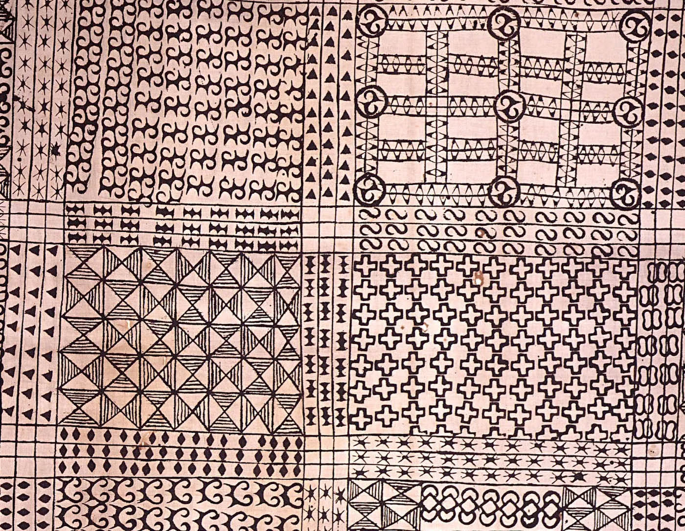
Adinkra Cloth: A traditional Ghanaian textile featuring intricate geometric patterns and symbolic designs, representing cultural wisdom and artistic heritage.

Global Symbols and Future Explorations
Though this article focuses on Western and digital traditions, the roots of character-based creativity are universal.
In West Africa, artists like Victor Ekpuk reinterpret Nsibidi, an ancient ideographic system, into powerful modern abstractions. In Ghana, Osei Bonsu continues to carve Adinkra symbols, each one a compressed philosophical insight. In Kenya, Kamau Kamau transforms traditional African beadwork into algorithmic art, where "pixels become beads and code becomes a loom", preserving ancestral aesthetics within generative systems that treat each pixel as a cultural unit.
In India, daily kolam drawings, preserved by artists like Subhashini Vasanth, transform algorithmic patterns into sacred geometry. Sculptor Ranjani Shettar reimagines these patterns into monumental installations. Each piece is a hand-coded poem in symmetry.
In Japan, anonymous creators on 2channel gave us Mona, a Shift-JIS icon that embodies the elegance and playfulness of digital folk art.
In Ethiopia, the ancient Ge'ez script endures in liturgical manuscripts, while artist Elias Sime crafts monumental mosaics from reclaimed electronic parts, technology transformed into tapestry.
These are not side stories. They are part of the same conversation: how humans, across time and culture, use structure to make spirit visible.
In a future article, I hope to explore these global systems in depth, drawing the map from symbol to code, from prayer to protocol.

Typortrait: An experimental self-portrait created using letters, featuring the PFTransport typeface by Parachute Type & Image Corporation. A creative exploration of typography and digital art.

Synthesis: When Letters Become Light – My Mosaic Journey
My fascination with structured images began early, influenced by my father's technical world and my own artistic instincts. These parallel paths converged in my typographic mosaic work, an approach that transforms the grid from a constraint into a creative catalyst.
While studying in Milan at the Scuola Politecnica di Design, I learned about Gestalt psychology, which helped me understand how people assemble separate pieces to form a complete picture. Professor Nino Di Salvatore's thought-provoking question, "Why do we see the world around us like this?", started a search for answers that still inspires my work. The Italian design tradition, which values clear visual organization and a genuine connection to materials, has influenced how I think about structure and form.

Typography Power: A typographic ASCII Art illustration created for a computer magazine article on 'Hackers,' using text characters to form a detailed portrait.

Early Works: Liberation from the ASCII Grid
My earliest typographic mosaics were direct descendants of ASCII art, but I quickly sought to break free from its limitations. While maintaining the philosophical core, finding beauty in constraint, I began pushing beyond monochrome and fixed-width characters.
Where ASCII artists had to choose a single character to represent a tonal value, I created multiple ASCII art layers, using different characters to highlight, shadow, and represent specific colors. This layering technique allowed for richer visual textures while preserving the character-based construction.
Early examples like "My TypePortrait" and "Typography Power" (created for the Greek magazine "ΧΑΚΕΡ (Hacker) back in 2006) mosaics retained ASCII's grid-based discipline but introduced color variation that was impossible in traditional text art. In these works, I maintained the strict matrix alignment but added chromatic depth:
Inspired by non-fixed-width ASCII experiments, I also began experimenting with different grid structures—column-based, brick-based, and eventually organic arrangements—freeing the characters from the strict monospaced limitations while maintaining their structural integrity. Works like "Craig Newmark ty-po-rtrait" (created for an article about the Craigslist founder in RAM magazine in Greece in 2006) and "Numbers for the rest of us..." inspired by the first Apple iPhone demonstrate this evolution from rigid to more fluid organization:
A vibrant blue typographic portrait of Alan Turing, composed entirely of text characters arranged to form his likeness. The design incorporates various shades of blue and red, creating depth and contrast against a dynamic background. This piece honors Alan Turing's legacy through a fusion of typography and creativity, using the PF DIN Display Pro typeface.

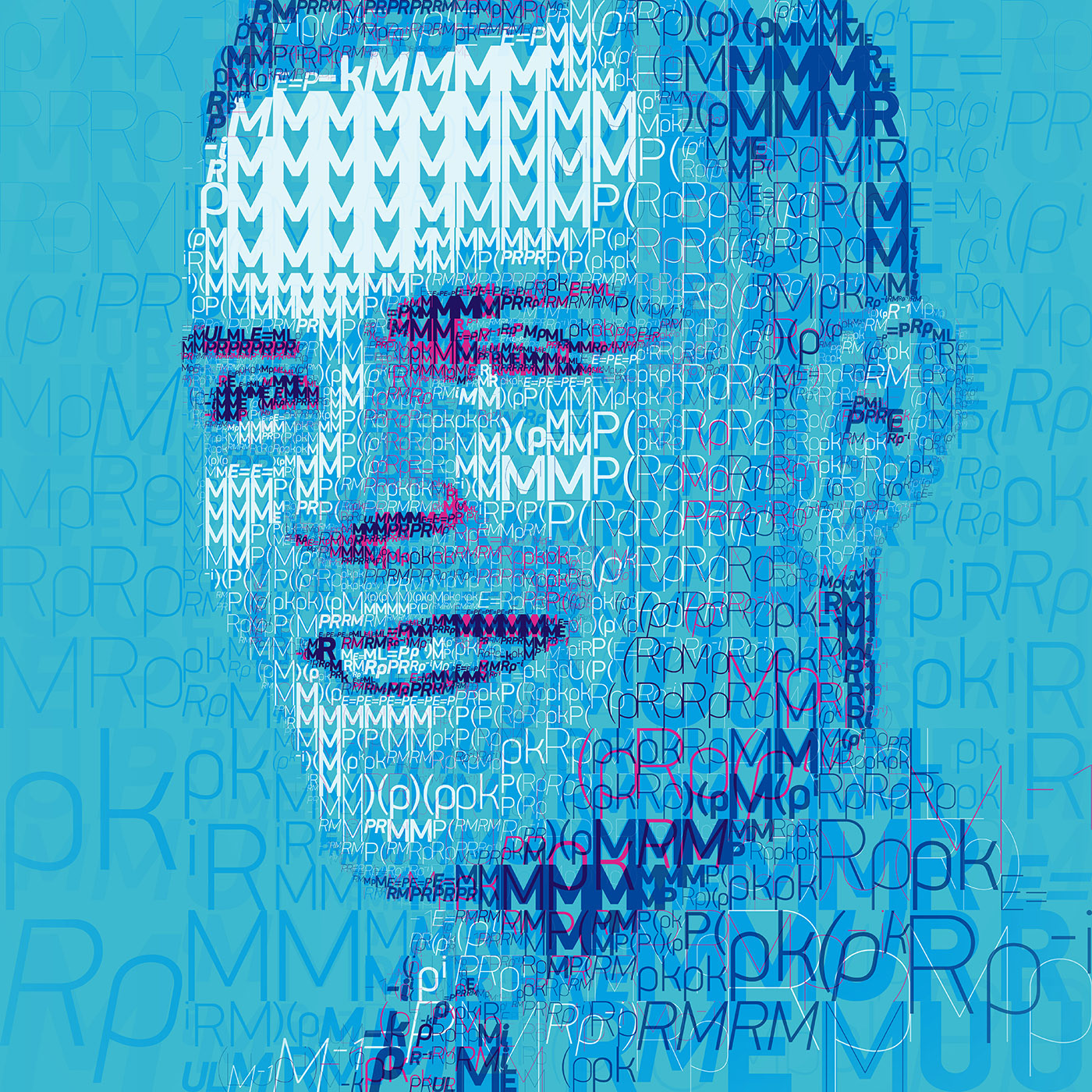
Decoding Alan Turing: Detail from the typographic portrait created using characters inspired by his code, crafted with custom scripts, creative tools, and a passion for design. The artwork uses the PF DIN Display Pro typeface by Parachute Fonts.

The ASCII tradition of using specific characters for their visual weight—where an "@" or other solid characters create dark tones and a "." light ones—evolved in my work to consider additional qualities like direction and movement. Drawing from semigraphics principles, I selected characters not just for tone but for how they could suggest contours and directional flow.
But another, more obvious option to a type designer like me, was to use different typeface weights for different tones. This is one of the most frequently used solutions I have employed in various professional and experimental works, such as "The 1s and 0s of John von Neumann" and "Decoding Alan Turing".
Obviously, once you surpass the limits of one typeface in one size, it's logical to change all possible parameters. Not just weight, but sizeanglecolor, etc.

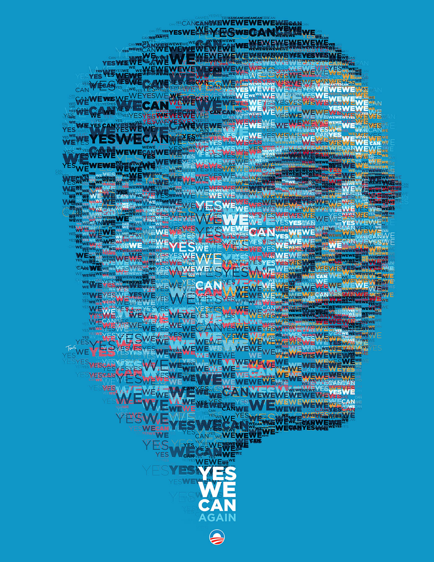
Yes We Can. Again: A typographic poster from the grassroots project Design for Obama by Aaron Perry-Zucker and Max Slavkin, featuring a portrait created entirely from repeated phrases.

Experimental Approaches: Beyond the Fixed Grid
So I began exploring variations that pushed further from traditional ASCII constraints. One significant breakthrough was the development of variable scaling techniques based on Gestalt principles. Instead of maintaining uniform character sizes across the composition, I introduced multiple scales, using smaller elements for areas requiring detail and larger ones for bold visual impact—a technique that extended the proportional font thinking of non-fixed-width ASCII to a more dimensional approach.
This created a more dynamic, three-dimensional quality than traditional fixed-grid methods. Works like "YES-WE-CAN" for this Barack Obama typographic mosaic portrait for Democrats Abroad in 2012, the "Barry Libert: Open everything" portrait, or the "Robert Miles: Dreamland (Experimental)" mosaic portrait demonstrate this evolution, with characters scaled according to their visual importance rather than a rigid matrix:
Influenced by the temporal dimensions of animated ASCII art, I also began experimenting with rotation and more complex color relationships, allowing the characters to flow organically through the composition to suggest movement. While my works remained static, they incorporated the kinetic thinking that made ASCIImation so compelling. The "Chariots of Color" series exemplifies this approach, with typography following dynamic contours that suggest motion frozen in time:

Typo CowGirl: Yeeha! (2007)
This innovative mosaic artwork showcases the power of community-driven creativity. Created during the early days of Flickr, it leverages found typography—photographic images of letters contributed by users globally—to form the iconic image of a cowboy. By embracing a crowd-sourced approach, the piece extends the traditional mosaic concept while fostering a sense of collaboration, echoing the spirit of ASCII art communities.

Another significant departure from traditional ASCII was shifting from individual characters to words and phrases as the building blocks. This introduced semantic meaning alongside visual structure, creating compositions where content and form reinforced each other. My "America for Pete" portrait is composed of the amazing calligraphic artworks of the 50 American States created for Pete Buttigieg's 2020 campaign for the presidential nomination by the Democratic Party.
When Flickr emerged as a platform for creative collaboration, I explored using found typography—photographic images of letters submitted by users worldwide. This crowd-sourced approach extended the mosaic concept while creating community around the work, adopting the collaborative ethos that made ASCII art communities so vibrant:
These are some of the many works I created based on the crowdsourced gems of the OneLetter Flickr group.
"Typo Cow-Girl", "Blah... blah... blah...", "Talk to me", "What you say?" and many more you can find in my Typography album.

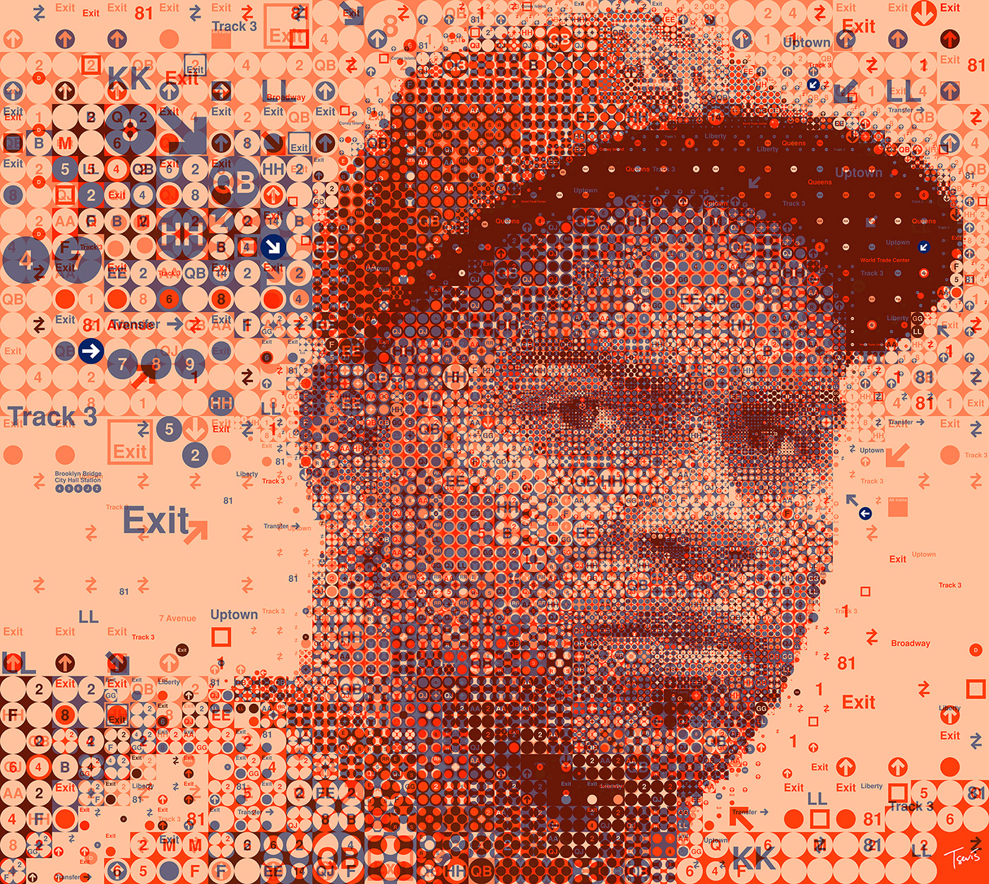
The New Yorkers: Yoenis Cespedes (Warm Version) – A mosaic portrait created using signs, icons, and symbols from the New York City subway system, blending urban context with artistic expression.

Drawing on semigraphics' use of specialized character sets, I've also created works that utilize specific symbolic systems relevant to their subjects. For a New York-themed project, I composed images using only subway line symbols and station markers, a specialized character set specific to that urban context:
Programming has provided another rich source of characters and structure. In several projects, like the "We can code it" for Mother Jones magazine, I've used code not just as visual texture but as meaningful content, where the syntax itself contributes to the overall concept, a nod to how ANSI artists used specialized code sequences for visual effect:
Some works combine typographic mosaics with information design, creating pieces that function simultaneously as portraits and data visualizations, a merging of the structured nature of character-based art with the informational density of modern visual communication. See the "Thom Yorke & Coachella by the numbers" piece for OC Weekly magazine.
The 1-Bit Mac Portraits: Homage to Digital Pioneers
The 1-Bit Mac Portraits of Steve Jobs and Susan Kare represent a deliberate return to the constraints of early digital design. Created in 2014 for the Steve Jobs month on Typorn.org (now Typeroom), these portraits utilized the set of Macintosh fonts created by interface designer Susan Kare in the early 1980s. Working strictly in 1-bit color (pure black and white), I constructed images that honor both the subject matter and the medium itself.
Detail of a monochrome, pixel-art-style portrait of Steve Jobs, created using characters from the Chicago and Monaco fonts. The image is composed entirely of black and white pixels, forming a detailed representation of his face and upper body. The text within the image provides context about the artistic process and historical significance of the fonts used..
A monochrome, pixel-art-style portrait of Steve Jobs, created using characters from the Chicago and Monaco fonts. The image is composed entirely of black and white pixels, forming a detailed representation of his face and upper body. The text within the image provides context about the artistic process and historical significance of the fonts used.

Steve Jobs Portrait in 1-Bit Pixel Art: A Tribute to Innovation and Design
This monochrome portrait of Steve Jobs is crafted using the iconic Chicago and Monaco fonts, which were integral to the original Macintosh interface. Each character placement was carefully selected to honor both the subject and the medium, paying homage to the pioneers of personal computing and the distinctive aesthetic of early Macintosh computers.

For the Steve Jobs portraits, I primarily used the Chicago and Monaco fonts, typefaces that defined the original Mac interface. The third portrait also incorporated Geneva. For Susan Kare's portrait, I used all six of her original font designs: Chicago, Monaco, Geneva, New York, Athens, and San Francisco. These weren't arbitrary choices; each font has historical significance in the development of human-computer interaction.
The technical process involved breaking down the original photographs (taken by Norman Seeff in the early 1980s) into a matrix where each cell could be populated with characters. Rather than using a simple algorithm, I carefully selected each character placement to maintain the integrity of both the portrait and the typography. The result is a double tribute, to the subjects who revolutionized personal computing, and to the pixel-based aesthetic that made early Macintosh computers so distinctive and approachable.
A triptych of monochrome, pixel-art-style portraits created using 1-bit color. The left and middle portraits depict Steve Jobs, rendered with characters from the Chicago and Monaco fonts. The right portrait features Suzan Kare, crafted using all six of her original font designs: Chicago, Monaco, Geneva, New York, Athens, and San Francisco. Each image is composed of black text on a gray background, forming detailed representations of their faces.

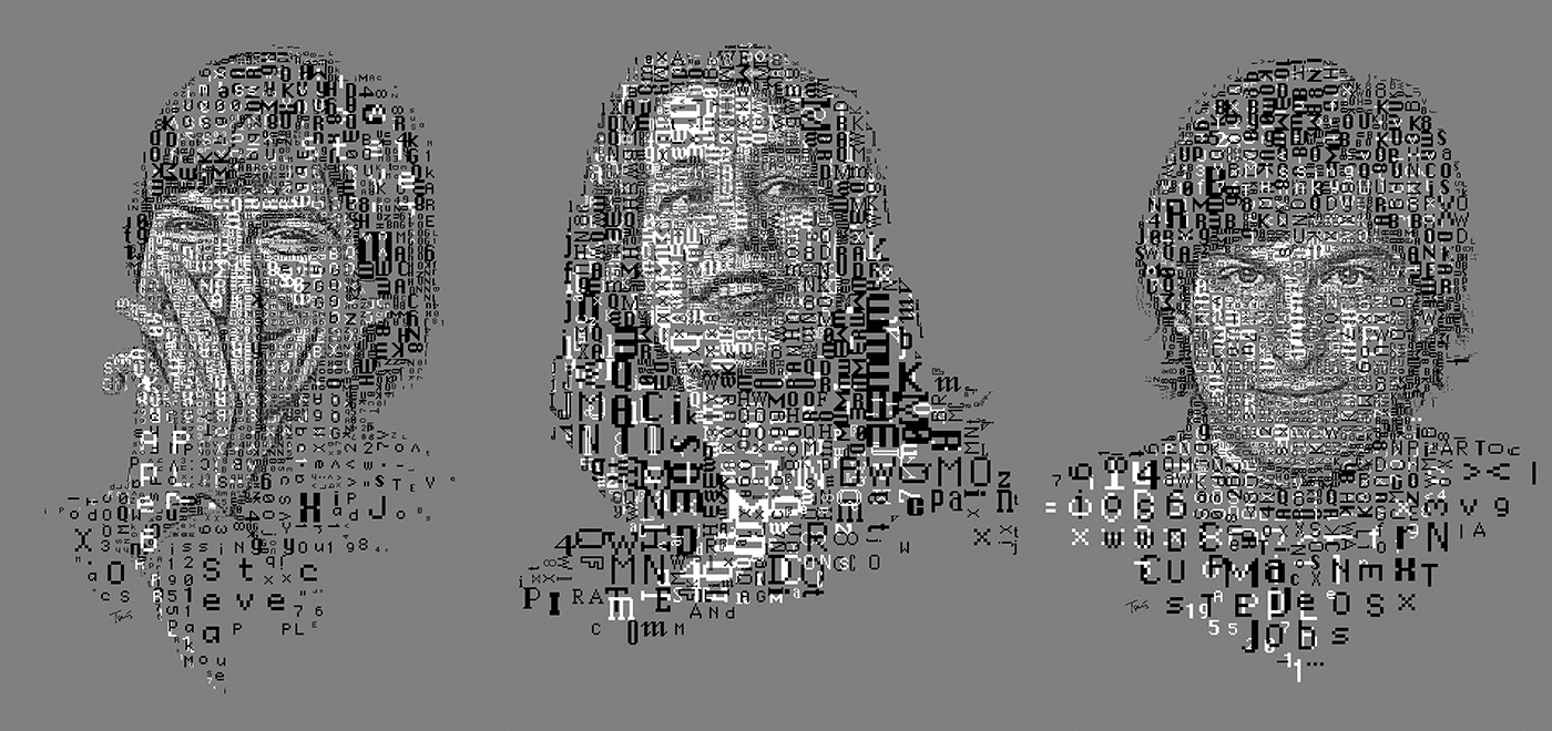
Digital Portraits of Steve Jobs and Suzan Kare in 1-Bit Pixel Art
This series of monochrome portraits pays tribute to the pioneers of personal computing. The left and middle images honor Steve Jobs, utilizing the iconic Chicago and Monaco fonts that defined the early Macintosh interface. The right image celebrates Suzan Kare, incorporating all six of her original font designs—a nod to her significant contributions to human-computer interaction. Each character placement was meticulously chosen to maintain the integrity of both the portraits and the typography, creating a double homage to these visionaries and the distinctive aesthetic of early Macintosh computers.

Siemens' A Better Way of Coding: Code as Visual Language
For Siemens' A Better Way of Coding campaign with Ogilvy New York in 2020, I created a series of multilayered typographic mosaics that transformed Python code into visual narratives. This project celebrated Siemens' acquisition of Mendix, a low-code software platform, by visualizing how code shapes our world, both literally and figuratively.
The technical approach here differed significantly from the Mac portraits. Rather than working with bitmap fonts, I used Courier, the quintessential programming font, to construct images of people, buildings, airplanes, and everyday objects. Each mosaic was built in multiple layers, allowing animators to create dynamic movement within the code world.

A Better Way - Coding is Humanly Possible for Everyone
Animation by Ogilvy New York based on digital Mosaic illustrations by Charis Tsevis.
Created for Siemens Mendix Low Code campaign.

The selection of Courier and Python was intentional due to their clean, readable syntax, which enhances visual clarity for both programmers and non-programmers. Arranging code snippets into recognizable forms established a visual metaphor for Siemens' low-code methodology, emphasizing the accessibility and integration of programming into daily activities.
This project presented unique technical challenges. Each element needed to be structurally sound, both in code and image; the snippets had to maintain enough programming logic to be recognizable as code while collectively forming coherent visual shapes. The layering system required careful planning to ensure elements could be animated independently without losing their visual integrity.
The systematic approach implemented in this project reflects the influence of Italian design education. The Italian tradition of comprehensive visual systems, in which each element contributes to a unified whole, informed the structuring of layers and components to function both collaboratively and independently as required.
A collection of six colorful mosaic illustrations of hand gestures, each rendered in distinct colors—green, red, blue, purple, and orange. The designs are composed of icons, words, and symbols, representing different sectors and areas of focus for MGMA. The background is black, highlighting the vivid colors and intricate details of each hand gesture.

MGMA Branding Mosaics: A Visual Language of Collaboration
This series of six hand gesture mosaics showcases the creative collaboration between MGMA and their advertising partner, BrandJuice. Each hand gesture is uniquely designed using icons, words, and thematic elements to represent different sectors and areas of focus within medical group management. The vibrant colors and intricate details highlight the dynamic and innovative nature of MGMA’s new branding identity.

A vibrant red mosaic illustration of a hand gesture, composed of various icons, words, and the letters "MGMA." The design is intricate, with elements such as "ask," "learn," "find," "stat," and other related terms forming the shape of the hand. The background is black, emphasizing the bold red color scheme.

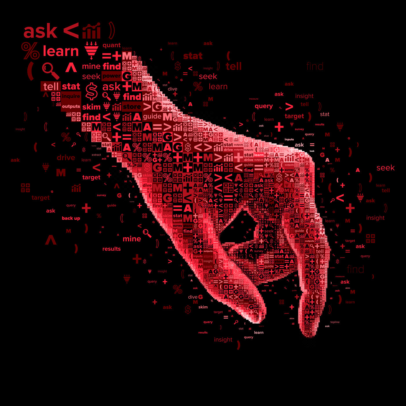
MGMA Branding Mosaic: A Symbol of Inquiry
This detailed mosaic illustration represents one of the 10 hand gestures created for MGMA's new branding identity. Crafted using icons, words, and the letters "MGMA," it symbolizes themes like inquiry, learning, and data analysis, reflecting the organization's focus on research and innovation in medical group management.

MGMA's 10 Hands: Typography as Human Expression
Another exploration of typographic mosaics is my "10 Hands" series created for MGMA (Medical Group Management Association). This project transformed human hands—symbols of connection, care, and professional expertise, into typographic compositions that convey the organization's values and mission.
Each hand was composed using different typographic techniques: some incorporated medical terminology reflecting MGMA's healthcare focus, others used organizational values and mission statements as their textual building blocks. The hands themselves were posed to convey different aspects of medical practice: the precision of surgery, the compassion of patient care, the collaborative nature of modern healthcare.
The technical approach involved mapping typography to follow the contours and musculature of human hands, creating a sense of organic movement within the rigid structure of typography. By varying character size, weight, and orientation, I was able to capture the subtle gradations and three-dimensionality of human anatomy.
In this project, I applied the principles of Italian design's "material honesty," which I absorbed during my time in Milan, allowing the inherent qualities of typography to remain visible while creating a larger visual narrative. This transparency about process and material is a hallmark of the Italian design approach I encountered during my studies.
A vibrant mosaic portrait of Greek South African musician Christina Rodokanakis, created using the elegant PF Regal typeface. The composition is layered with various characters and symbols in shades of brown, blue, and yellow, forming a detailed representation of her face against a soft pink background.

Layered Typographic Mosaic: A Portrait of Christina Rodokanakis
This striking mosaic portrait showcases the artistry of layered typography, utilizing the newly designed PF Regal typeface. Created by Panos Vassiliou, this elegant composition captures the essence of Christina Rodokanakis through intricate details formed by letters, numbers, and symbols. The harmonious blend of colors and typography highlights the beauty and complexity of typographic art.

The Digital Typographic Mosaic Style: Methodology and Evolution
Across these projects and others, I've developed what I call the "Digital Typographic Mosaic Style"—a technique that uses letters, words, numbers, and code as building blocks for complex visual compositions. This approach can take several forms:
Structured Grid Mosaics: Characters arranged in a regular grid pattern, where the selection of specific characters creates the overall image (as in the Mac portraits).
Variable-Scale Typography: Letters and symbols of different sizes arranged to create depth and dimensionality, with smaller characters in areas requiring more detail.
Layered Typographic Compositions: Multiple layers of text elements that collectively form a coherent image but can be separated for animation or to create parallax effects.
Programming syntax arranged to follow the contours of an image while maintaining some semblance of logical structure.

London 2012: A Visionary Mosaic
This experimental typographic illustration captures the essence of London's creative spirit during the 2012 Olympics. Using the PF DIN typeface, the design blends industrial aesthetics with the vibrant energy of punk rock and rave culture. The use of fluorescent colors reflects the natural continuation of Jamie Reid’s punk rock cover art and the hues of the rave era, creating a fresh and engaging visual identity that celebrates London as a 'Dream City.

These approaches are unified by the tension between the structured nature of typography and the organic forms of the subjects being depicted. This tension, between the digital grid and analog reality, creates a vibrant energy in the work, reflecting our hybrid experience of digital and physical worlds.
This dynamic approach to composition draws directly from my studies of Italian Futurism, which I undertook while in Milan. The Futurists' techniques for depicting motion through fragmentation and repetition inform my approach to creating a sense of movement using static typographic elements. Similarly, the Italian design tradition's emphasis on visual rhetoric, how images can construct arguments and narratives, guides my approach to mosaic portraits that tell stories about their subjects through their component elements.
A screenshot of a code editor displaying Python code for the GestaltMono algorithm, part of the Mozaix project. The file structure on the left shows various directories and files related to matching algorithms, including gestalt_mono.py, rs1996.py, and others. The main code section on the right includes functions such as _analyze_depth, _estimate_gradient_depth, analyze_gestalt, and more, which are designed to evaluate visual perception principles like contrast, depth, and line continuity.

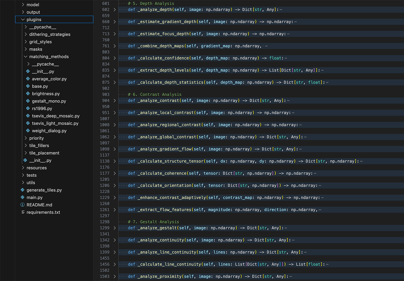
Behind the Scenes of GestaltMono: A Sophisticated Matching Algorithm
This image showcases the core codebase of the GestaltMono algorithm, which forms the heart of the Mozaix project. Unlike traditional pixel-matching methods, GestaltMono leverages principles from Gestalt psychology to analyze typographic elements based on perceptual qualities such as line flow, negative space, and character interaction. The code demonstrates advanced functions for depth analysis, contrast evaluation, and gestalt principles, reflecting a sophisticated approach to creating visually harmonious mosaic art.

Mozaix: Encoding the Artistic Process
After years of exploring mosaic techniques, I created Mozaix, a software program that captures my artistic process in code. Unlike other mosaic generators, Mozaix is built around the same aesthetic ideas that shape my hands-on work.
At the core of Mozaix are its matching algorithms, especially GestaltMono. I named it after Gestalt psychology, which I studied in Milan. Instead of just matching pixels by tone, GestaltMono considers how lines move, how empty space functions, and how characters interact with one another.
Where conventional ASCII generators reduce images to grayscale and assign characters based solely on their "blackness" or tonal weight, GestaltMono employs shape-fitting algorithmic approaches influenced by edge detection techniques. It analyzes the structural properties of each character in monospaced fonts, mapping not just their visual "weight" but their directional qualities and edge characteristics. It understands, for instance, that a forward slash (/) has both a tonal value and a directional quality that can contribute to the flow of an image, while an 'O' creates a different visual weight than an '8', despite both being similarly dense.
By focusing on the details of typography, Mozaix helps create mosaics where the text adds to the image’s structure and movement. The algorithm extends beyond simple intensity mapping, utilizing concepts from computer vision and AI to provide a deeper understanding of form in the process.
The algorithm also incorporates variable scaling, a technique I pioneered in my manual mosaics, automatically determining where smaller characters are needed for detail and where larger elements can create bold visual impact. This creates a more dynamic, three-dimensional quality than traditional fixed-grid approaches.
What makes Mozaix distinctive is that it's not designed to replace the artist but to extend their capabilities. The software includes interactive tools that enable manual refinement of algorithmically generated compositions, preserving the crucial element of artistic judgment while automating the most labor-intensive aspects of mosaic creation.


A vibrant mosaic illustration of a person playing a saxophone, created using elements from the QRator logo. The figure is composed of colorful circles and dots in shades of blue, pink, and white, set against a bright teal background. The artwork incorporates parts of the QRator logotype, including the letters "QR" and other abstract shapes, to form an energetic and dynamic design.

QRator: Join the Fun!
This lively mosaic illustration was created for Qrator.com, a social network startup aiming to be the hub for lifestyle artists and creative professionals. The artwork features a skateboarder, crafted using elements from Qrator’s beautiful logotype. The use of bold colors and dynamic shapes reflects the platform’s vibrant and creative spirit, inviting users to join the fun.

A Philosophy of Constraint
More than a technique, ASCII art is a philosophy. It tells us:
You don't need infinite tools to express something profound.
You can work with what you have, and still surprise yourself.
To make something memorable from 95 printable characters isn't just clever. It's human. It's poetic.
In this world of unlimited pixels and frictionless design, ASCII art remains a quiet act of resistance. A celebration of slowness, of thought, of composition within constraint.
Sometimes, all you need is a dot, a slash, and the courage to imagine.

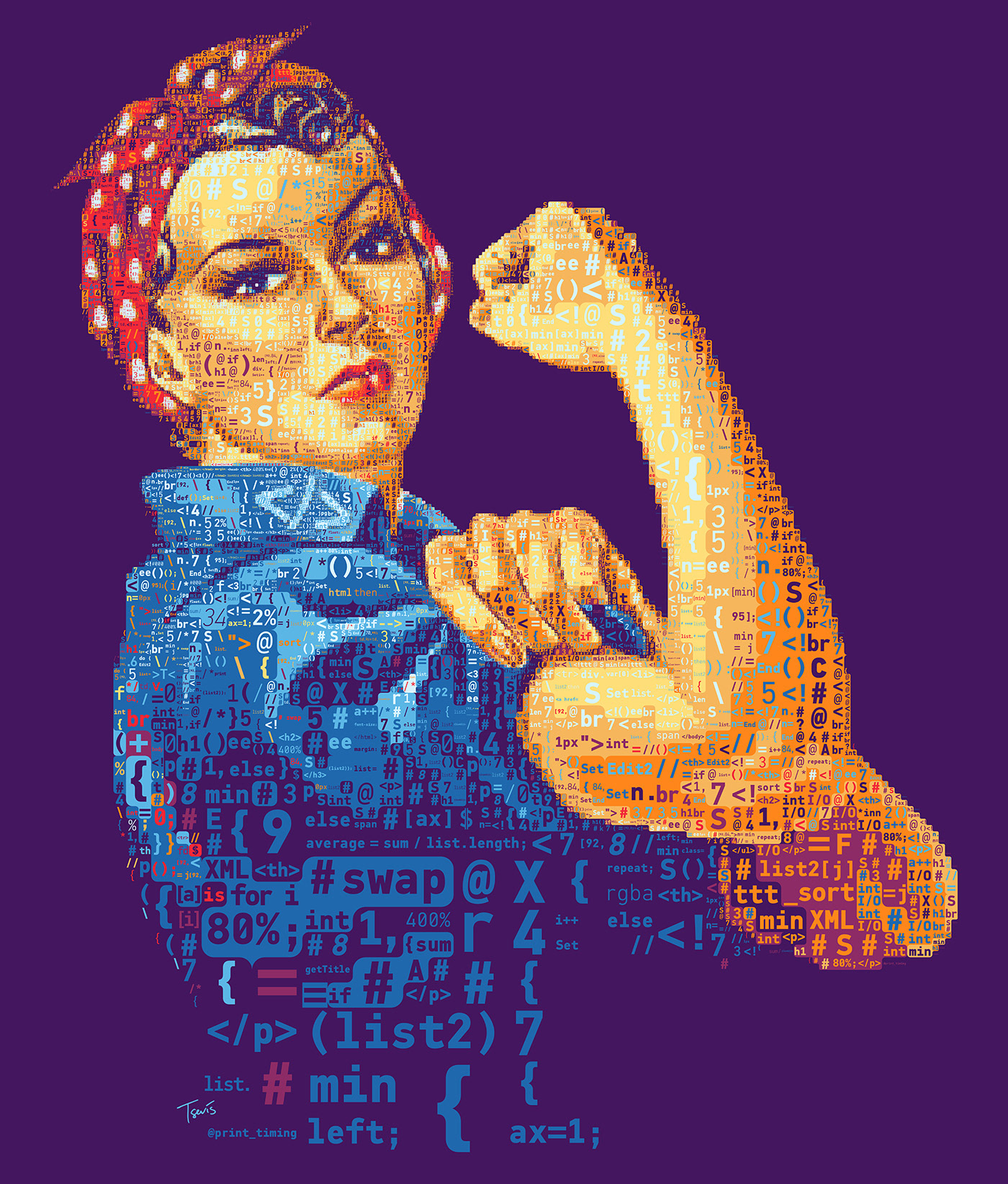
Rosie the Riveter: A Mosaic of Code
This mosaic portrait of Rosie the Riveter was created for an article on Mother Jones magazine about diversity and sexism in the IT world. The artwork is crafted using lines of code from various programming languages, symbolizing the fusion of strength, resilience, and technological innovation. By representing Rosie through code, the piece underscores the importance of inclusivity and empowerment in the tech industry.

Epilogue: The Eternal Grid
ASCII art endures because it is more than nostalgia; it's a testament to human ingenuity in finding beauty within constraints. From my father's exploration of early computing systems to my own digital mosaics, from the mechanical typewriters of the 19th century to the algorithms of Mozaix, the impulse to transform the rigid grid of technology into fluid expression remains constant.
In a world where technology often prioritizes the seamless and the invisible, there is profound value in art that reveals its own structure, celebrating rather than concealing the grid beneath. My mosaics, like ASCII art before them, embrace the pixels, characters, and code that constitute our digital world, finding in these building blocks not limitations but possibilities.
As we move into an era of seemingly limitless digital canvas, perhaps the most revolutionary act is to embrace constraint, to find, as the ASCII artists did, that creativity flourishes not despite boundaries but because of them.
In a world of infinite pixels, sometimes the most profound beauty lies in the grid. A lesson, perhaps, that began with a father's gentle guidance, and continues in every character meticulously placed.
A modern photograph of two men sitting together at an outdoor table, smiling warmly at the camera. The younger man, dressed in a turquoise shirt, leans affectionately toward the older man, who is wearing a white shirt and patterned tie. The background features a serene sunset over the ocean, evoking a sense of connection and shared memories.

My Dad and Me in Santorini, 2017

Sources and Further Reading
Barrie, Lita. Typewriter Art: A Modern Anthology. London: Laurence King Publishing, 2014.
Popular Science magazine archives, 1939-1948.
Knowlton, Kenneth, and Leon Harmon. "Studies in Perception I." Bell System Technical Journal, 1966.
Danet, Brenda. Cyberpl@y: Communicating Online. Oxford: Berg Publishers, 2001.
Scott, Jason. "BBS: The Documentary." Documentary film series, 2005.
Stark, Joan G. "The Joan Stark ASCII Art Collection." ASCII Art Archive, 1998-2006. https://www.asciiart.eu/joan-stark-gallery
Peterson, Dale. Genesis II: Creation and Recreation with Computers. Reston Publishing Company, 1983.
Katsuno, Hirofumi and Christine Yano. "Face of the Nation: Articulating Japanese Kawaii on the Internet." Japanese Studies 27(2), 2007.
Jansen, Simon. "Star Wars ASCIImation." 
Conradi, Jan. Unimark International: The Design of Business and the Business of Design. Lars Müller Publishers, 2010.
Pintori, Giovanni. "Design is Publicity." Interview in Graphis magazine, 1958.
Kicherer, Sibylle. Olivetti: A Study of the Corporate Management of Design. Trefoil Publications, 1990.
Whitfield, Susan. Life Along the Silk Road. University of California Press, 2001.
Di Salvatore, Nino. Theory of Perspective Space. Scuola Politecnica di Design, Milan, 1988.
New York Institute of Technology. "Lessons From the Best Years of My Life." Lecture by Charis Tsevis, November 9, 2023.
"Steve Jobs: The 1-Bit Mac Fonts Portraits." Typeroom.eu special feature, October 2014.
Kare, Susan. Susan Kare: Icons. Museum of Modern Art Publications, 2018.
"Siemens: A Better Way of Coding." Project documentation. https://tsevis.com/siemens-a-better-way-of-coding
"10 Hands for MGMA." Project documentation. https://tsevis.com/10-hands-for-mgma
Tsevis, Charis. "Digital Typographic Mosaic Style." Process documentation. https://tsevis.com/mosaic-styles
Lista, Giovanni. Futurism. Universe Books, 1986.
Eno, Brian. "The Revenge of the Intuitive." Wired magazine, January 1999.
Additional Explorations
Books and Articles:
Karin Wagner, From ASCII Art to Comic Sans: Typography and Popular Culture in the Digital Age, MIT. Press, 2023
Blackwell, Lewis. The End of Print: The Grafik Design of David Carson. Chronicle Books, 2000.
Boden, Margaret A. The Creative Mind: Myths and Mechanisms. Basic Books, 2004.
Hyde, Lewis. The Gift: Creativity and the Artist in the Modern World. Vintage, 2007.
Levy, Steven. Hackers: Heroes of the Computer Revolution. O'Reilly Media, 2010.
Douglas Rushkoff, Cyberia, Life in the Trenches of Cyberspace, HarperOne, 1944
Online Resources:
ASCII Art Emporium: https://ascii.mozz.us
The Art Of Warez: https://vimeo.com/341663153
16colo.rs (ANSI Art Archive): https://16colo.rs/
Textfiles.com Art Archives: http://www.textfiles.com/art/
Internet Archive's BBS Collection: https://archive.org/details/bbsarchive
Structure-based ASCII Art, Xuemiao Xu, Linling Zhang, Tien-Tsin Wong https://ttwong12.github.io/papers/asciiart/asciiart.html
History of ASCII Art. Probably the first complete document about the art form on the Internet. Today in Archive.org
Typewriter Art:
James Cook (Contemporary Typewriter Artist): https://jamescookartwork.com/
John Brownlee, A Short History Of Typewriter Art.
Museums and Exhibitions:
Museum of Modern Art: Electronic Typography Collection
Cooper Hewitt Design Museum: Digital Typography Archive
Computer History Museum: Early Computer Graphics Exhibition
Triennale Design Museum (Milan): Italian Graphic Design Collection
Museum of Digital Art (Zurich): Algorithmic Art Collection
Museum für Gestaltung, Zurich
My Work and Projects:
Siemens: A Better Way of Coding: https://tsevis.com/siemens-a-better-way-of-coding
Mozaix Project Documentation (forthcoming)
Global Symbol Systems & Cultural Visual Languages
Chinese Character Art & East Asian Digital Typography:
Mullaney, Thomas S. The Chinese Computer: A Global History of the Information Age. MIT Press, 2024.
Mullaney, Thomas S. The Chinese Typewriter: A History. MIT Press, 2018.
Liu, Yuli. "Chopsticks, Pixels, and the Pioneers Who Redesigned Modern Chinese." Technology Review China, 2018.
Baidu Tieba 字符画 (Character Art) Forum Archives: https://tieba.baidu.com/f?kw=字符画
Tianya Club Digital Art Forum
West Africa:
Victor Ekpuk (Nigeria / Nsibidi)
Osei Bonsu (Ghana / Adinkra)
Sylvester Ogbechie – Making History: African Collectors and the Canon of African Art (2007)
India:
Ranjani Shettar (India / Kolam-inspired sculpture)
Subhashini Vasanth Kolam Collectives
Marcia Ascher – Mathematics Elsewhere (2002) - Study of indigenous mathematical systems
Vidya Dehejia – Indian Art (Phaidon) - Overview of India's symbolic traditions
Japan / East Asia
Mona (もな) and the 2channel AA Community
2channel ASCII Art Archive (English intro to Shift-JIS and AA)
Ethiopia
Elias Sime (Ethiopia / Circuit Art)
Ethiopian Script & Calligraphy
The ancient Ge'ez script tradition continues in liturgical manuscripts.

Charis Tsevis is a visual designer with over 30 years of experience exploring the intersection of art, design, and computing. Holding a Master's in Visual Design from Milan's Scuola Politecnica di Design, his work delves into typographic mosaics and character-based art. A member of Parachute type foundry since 2001, where he has designed numerous typefaces, and a typography educator for over two decades, his insights are shared through his global design practice and frequent lectures on design history and aesthetics at institutions such as the New York Institute of Technology, University of Nebraska Omaha, and the American College of Greece.
Back to Top